I saw this comic strip in Spanish and I couldn’t avoid translating it into English. It’s the ultimate truth!
Category: Internet and technology
Microsoft has had a lot of trouble with investors lately, all of them pressuring the big software giant to finally take a strong stance towards the rising tablet market. So it should come as no surprise at all that Windows 8 focuses strongly on tablets. What is totally surprising though is the way it’s going to do it.
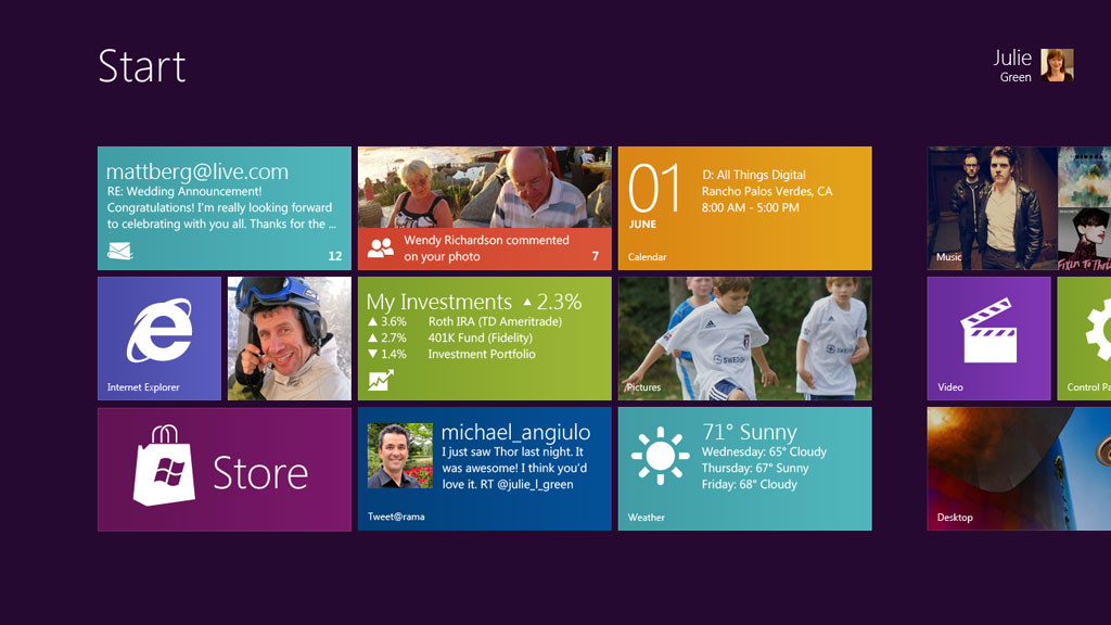
Yes, as shocking as it seems the picture above is the new start screen of Windows 8, be it on a tablet, a laptop or a desktop PC.
The traditional Windows interface will still be available, but in some way I really hope Microsoft will use this only for legacy applications and instead push forward a single, consistent UI for all the users. Otherwise we would be walking into a mess of two UI paradigms running side-to-side, something confusing for users.
And at the same time I’m not completely sure about this new UI when it comes to laptops and desktop PCs. It’s very slick, beautiful and simple, just like the Metro UI from Windows Phone 7. But this new UI would completely change the way people work with Windows, mostly when it comes to multitasking.
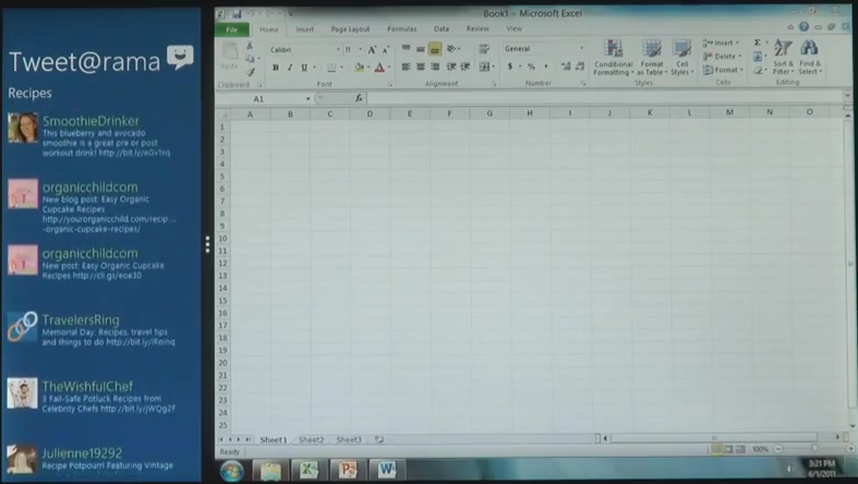
Office 2010 running alongside a new Windows 8 app, showing that old and new can live together
Sure, Microsoft has already shown how multitasking works on Windows 8 but I’m pretty sure that most power users will need much more than that. One example: the traditional drag-and-drop convention when working with files. I for one drag and drop many pictures into Photoshop, a much faster way than going through menus to import a picture into the canvas. Unless Microsoft figures out a way to provide such easy actions I fear I would be returning to the old, Windows 95 era style, and that for me defeats the purpose of having a new modern UI.
Otherwise the new “immersive” UI as Microsoft calls it looks really, really good, and I can see how the everyday Joe will have it much easier to do what he wants on his computer.
Microsoft says that the new immersive apps will be created using HTML5 and JavaScript technologies, which really brings up Microsoft’s latest strategy of “software + services”. I really believe that through HTML5 and other web technologies we can get some really strong functional apps that auto-update thanks to them being hosted on the web (which is, by the way, Google’s stance on the future of cloud computing).
One topic that hasn’t been brought up yet although I’m sure it will later next week during the Electronic Entertainment Expo 2011 (E3 2011) is that of games on Windows 8.
Microsoft has already stated previously that they want to push gaming as a strong part of Windows 8. If you consider the entire range of tablets that will be running this OS it makes sense, seeing how developers will probably make a lot of new games for the form factor.
If you add to this the fact that those games should be perfectly playable on a laptop or desktop PC and they will probably be sold through the Windows Marketplace, you suddenly have a potentially big competitor to Valve’s own Steam online videogame store.
By the way, here’s a prediction of mine: I’m almost convinced that Microsoft will rename all of its gaming services to Xbox LIVE or similar.
They already put all of the games on Windows Phone 7 under the Xbox LIVE brand, no matter if the games are Xbox LIVE enabled or not.
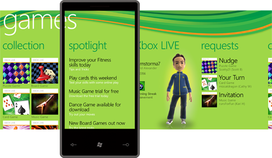 The Games hub on Windows Phone 7 as it is right now (there will be some major modifications with the Mango update)
We’ve also heard several comments that Microsoft wanted to unify all of their entertainment services under the Xbox name as well, such as Zune. And finally, Microsoft recently merged the Games for Windows forums with the Xbox forums. So don’t be surprised if we see Microsoft trying to push Windows 8 as Xbox compatible. Of course I don’t mean that Xbox 360 games will run on a PC, but rather that it will be considered another platform for the Xbox brand.
Obviously these are just my thoughts, not anything that is fully backed up by quotes or facts.
In the end I’m truly excited about the prospect of Windows 8. It’s still very early to judge the new UI and I’m sure Microsoft is working hard to make sure it becomes a fully functional one so that users don’t switch back to the legacy UI. As such I’m impatient. I can only try to guess how successful this move will be for Microsoft, but information is still too scarce to know for sure yet. As a heavy Microsoft user though I truly hope they get it right.
Ok, so I’m really happy for the way Google is advancing modern technology in so many ways. Not admitting that Google has created a huge online revolution would be stupid.
But I cannot watch Google’s latest I/O Android keynote and turn a blind eye on them.
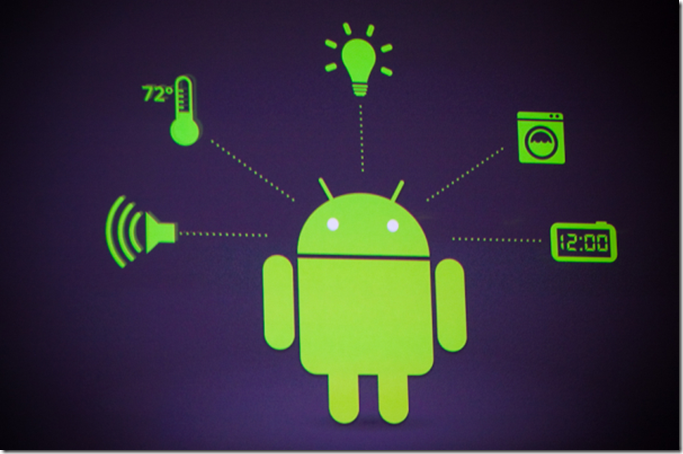
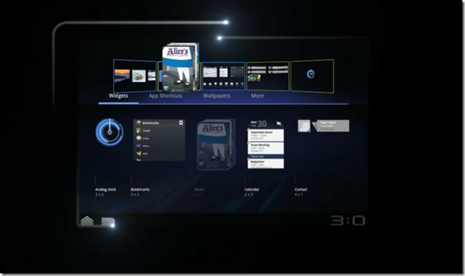
Their latest proposal: have Android everywhere. Not just your phone. Not just your computer. Not just your tablet. But literally everywhere.
Forget the privacy issues. This is all about Google trying to have control over every single device we own. Remember Terminator’s Skynet? Well, we’re getting there.
Of course I’m just over-reacting here. First of all I don’t expect Google to suddenly take over the entire market with Android products. And I definitely don’t expect the apocalypse to come from this. But I do think that it is not right for a company as big as Google to be omnipresent in our lives. It just gives them too much power.
Having a system in which all the devices at home and at work can talk to each other would be ideal. But it should not happen this way.
Dear Microsoft,
My name is Anchel Labena, a 22 year old student and technology enthusiast and tech columnist for Voice of America in Spanish.
I am writing this open letter to you to bring up my growing concerns about the future of your search engine, Bing.
First of all let me clarify that I am indeed a Bing user and have been so even in its old days when it was still named “Kumo”. I even have a Bing t-shirt that I was mysteriously sent to me in Denmark all the way from your campus in Redmond.
And while I really support what you are trying to accomplish with Bing, I have an increasingly long list of complaints that I really need to get out.
You see, I have lived in the United States and I know first hand that many US-based online services offer a lower quality option abroad. I completely understand that situation. After all, fully localizing a product is an expensive task, even more so when it comes to a constantly changing one such as a search engine.
But the total lack of localization of Bing is a complete disaster for the future of the search engine and an embarrassment to the entire Microsoft company. Both in the desktop search market and in the mobile search landscape.
Let me show as an example the following picture comparison:
Bing in the United States (left) and Bing in Denmark (right) – The example of Bing Denmark applies to most countries too.
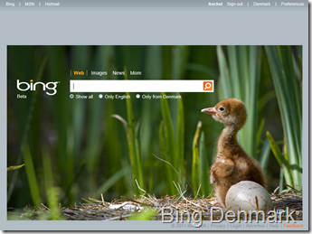
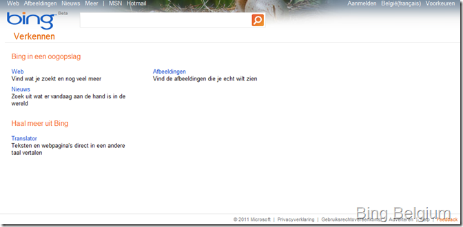
As can be seen in the pictures, Bing in the US has a lot more features than the Danish site even by just taking a glance at the homepage. Whereas Bing US gets web, images, videos, shopping, news, maps, travel, entertainment and more services hidden under the explore link on the top-left, Danish and most overseas users are left with images, news and more only. And the more link simply takes them to an embarrassingly empty page that just adds a link to Microsoft Translator.
The MORE page in Bing Belgium
Not only that, but Bing US also includes some niceties in its homepage that are completely missing in other countries. For example: each day the Bing US homepage shows a new picture that, when hovering the mouse on it, shows some interesting facts and related searches that are usually very fun to read. Overseas, these facts simply don’t exist. In Bing US you get a “popular searches” box that works in a similar fashion to Twitter’s trending topics. Overseas you don’t. Bing US has a really nice Facebook integration that enhances the search results by displaying friend search results or if your friends liked a link. Overseas? Of course not.
This list could go on forever with many features like the search history, the flight search, the related searches, the weather reports…
But the most incomprehensible and pointless missing feature overseas is that Bing US and Bing overseas HAVE COMPLETELY DIFFERENT SEARCH ENGINES.
I am not talking about Bing showing local results in a different language for different countries. I am talking about how Bing in the US has a constantly improving search engine, always trying to provide more relevant results and more interactive experiences while overseas we get pretty much the same search engine that was offered in 2007 with Live Search.
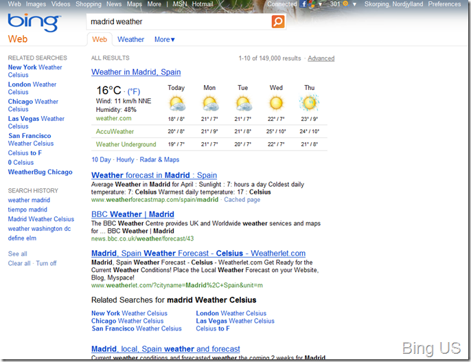
Again, this is best shown with a picture example:
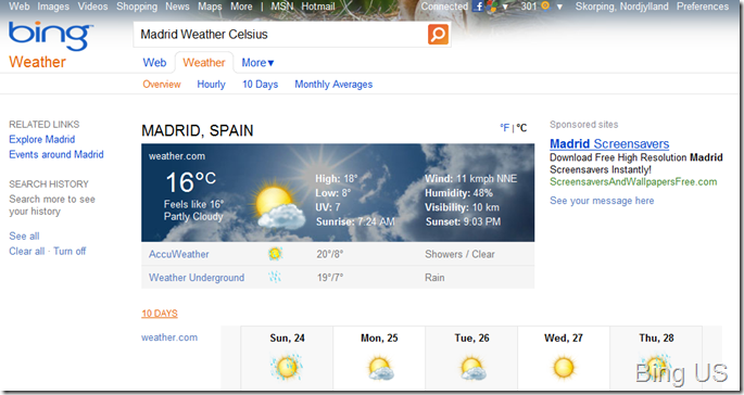
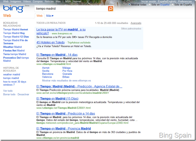
As you can see, Bing US detected I was looking for the weather in Madrid, so it automatically showed me as the first result a weather aggregate from several sites. Even more, the Weather tab appeared that takes you to a nice-looking, more detailed weather page with lots of links to more precise reports:
If you do the same search in Bing Spain for example, the resulting experience is nowhere close:
This situation repeats itself in several other searches. Let’s try some entertainment-related searches:
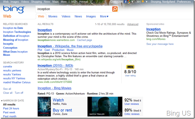
Inception: Notice how Bing US brought up IMDB’s user rating, direct links to watch on Netflix and Hulu, rent or buy on iTunes and Zune, and even a direct link to the trailer. If you scroll down the page you get even more rich results from Apple and Microsoft websites, and even news results that are related to the movie. Bing Norway didn’t even bring the movie Inception among the first three results.
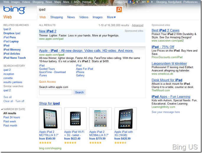
iPad: A search for Apple’s tablet solution brings up a very complete box that not only shows links to all the related iPad pages on Apple’s own website, but it also lets you search within Apple.com without leaving Bing. Even better, it shows links to several shopping pages where you can find the best deal for the product. I tried the same in Bing Sweden, and the results were disheartening, besides the fact that Bing Sweden even lacks the sidebar with related searches.
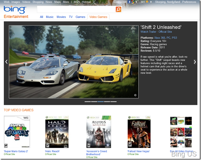
The differences go on and on in pretty much every search area, with some really interesting features like the Entertainment searches being sorely missed abroad.
While I am in the topic of these rich experiences, let me dive into the topic of Bing Maps.
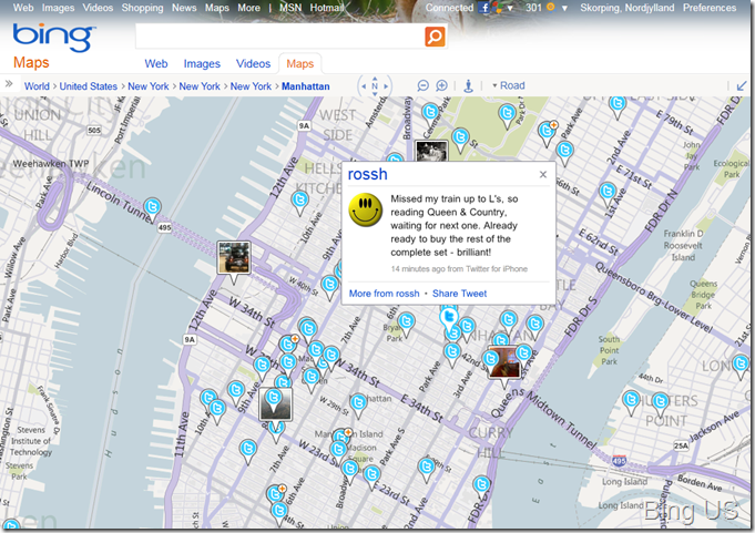
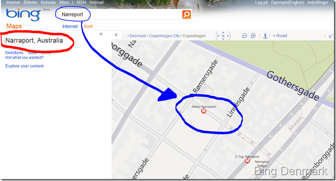
It is absolutely unacceptable that Bing Maps doesn’t turn up correct results when looking for the name of a street. Even less so when using the mobile version of Bing. Of course, Bing US will show the exact location of pretty much every street, store, movie theater or anything. It even has a very compelling Facebook Friends search that locates your friends on the map, or the Tweets in the area you are zoomed in to. But searching for the street Studiestræde or the metro station Nørreport in Copenhagen, Denmark, showed no results at all. One could think that this is because these names have Danish-specific characters, but streets without them also have the same problem.
The Bing US Maps showing real-time tweets in Manhattan – Of course Bing Overseas doesn’t even have a Bing Maps page.
Bing Denmark cannot even find a metro station that is clearly shown in the map, instead taking users to Australia
Summing up, while the US is getting an incredibly strong Bing offer (and the market share analysis show that Bing is doing very well over there, with a 30% of the market and going up), the rest of the world is getting mixed situations. Bing in the UK is the most acceptable of them all, but every other country gets a “Beta” version of Bing (which is even shown literally as a beta under the Bing logo). Not just a beta, but a broken service that is nowhere close to what the US is offered.
I understand that these things take time and money, but Bing has been out there for well over a year, and while the US version has significantly improved in every imaginable way, everyone else gets the same outdated experience that was offered years ago.
I have already had to listen to countless comments from friends saying “why do I use Bing”. Everyone tells me that they hate Bing because it turns up irrelevant results and that the experience feels empty. Of course these are European users that do not even know what Bing has to offer when you simply switch the country to the United States in the preferences.
Microsoft, by delaying a proper version of Bing to the entire world you are only causing a total distrust into the brand. By the time you finally release the full experience, if you ever plan on doing so, people will be so fed up with the current state of the search engine that nobody will even bother to give it a try, with their minds still set on Bing as a terribly lackluster competition attempt against Google.
I like Bing. I really do. But I always have to keep it with the US settings every time I install a new browser or use a different computer. I have to use Google Maps when I try to search for a street in a European city. I stop looking for shopping items in Bing because it shows no offers at all from European dealers…
Please Microsoft, get it right this time. Markets evolve as companies struggle to offer better solutions to their clients. Right now in Europe Google is the only option. Bing isn’t an option in Europe the way it is right now.
Sincerely,
Anchel Labena
Some people make some amazing stuff. Then some Japanese guy MAXES IT OUT TO ITS FULLEST!
Who hasn’t played with LEGO? Well, this Japanese guy made the most impressive moving LEGO set I have ever seen (admittedly combining it with non-LEGO pieces).
It is seriously worth giving it a look, even if you don’t watch the entire video just look at the first part. You will be really impressed. Or I’ll eat my shoe.
It looks like Apple has got on the wrong side of many technology companies!
With the huge success of Apple’s iPad it’s no surprise that others would follow in their footsteps and release tablets of their own. But it hasn’t been until Google’s announcement of Android 3.0 Honeycomb, Google’s foray into tablet-specific OSs, that hardware makers see a strong chance to get a slice of Apple’s juicy cake it had taken for itself.
Mind you people, tablets are great devices, although they are usually not absolutely necessary to anyone yet. But hardware makers do not care about that and will still continue to flood us with tablets of all kinds (do I already fear a market saturation?).
In any case at least two companies have seen very fitting to tackle the Mac people by directly stabbing their backs.
Don’t believe me? Watch the following commercial for LG’s Optimus Pad!
“The war is not over”? “Optimus will destroy evil!” pronounced right as the “good” robot smashes the brushed aluminium one into a building with a red apple painted on it? The “good” robot crushing an apple in his hand? Talk about being subtle… This is an Apple criticism all the way down!
You have to give it to the LG people though. The commercial is hilarious, with lots of references to the Transformers movies (DreamWords LG, Padmount, directed by Michael Boy and Steven Spillback as executive producer, among others).
But that video is not all there is out there. Motorola also showed a commercial for their upcoming Motorola Xoom tablet during the Super Bowl. It’s premise? To make fun of all the Apple fanboys who all look the same. Watch below!
This video doesn’t lack any Apple references either. Everything from the 1984 book the man is reading to the white iPod-like earphones everyone else is holding to with their hands. The irony here is that while Apple begun their first commercial by criticizing how everyone was using the same computer and they needed to be different and break free, Motorola now brings up the fact that it is now Apple who has assumed the monopoly spot.
Watch out Apple! You are no longer the only worthy competitor in the tablet space, and your new opponents are looking forward to hit you hard with revenge!


