Categories
Internet and technology VOA

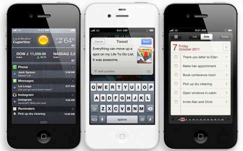
iPhone 4S: revolution or innecessary?

image

I had already posted this article in Spanish on the Technology section of VOANoticias.com but since I had this English version of the article ready as well I decided to publish it here for those of you who didn’t want to use an online translator for it. Without further delay, here it is:

It’s incredible the amount of media attention Apple can get. Even since the beginning of the year the rumor machines have been churning out speculations about what the future iPhone 5 would have. But as soon as news got leaked that the Cupertino company would present its latest in October, the expectations rocketed sky high: a bigger screen, a thinner profile, no home button, a revolutionary battery…

And Apple definitely deserves the high expectations. When Apple first announced the iPhone it was a real revolution thanks to its innovative multi-touch screen and its ease of use. A year later the iPhone 3G introduced the App Store, changing forever the way people thought of phone applications. The competition rushed to catch up with this new intruder in their own space but they always released incomplete products that were not up to Apple’s standards.

But now the competition has beaten Apple. So it is Apple who has had to rush to catch up to them.

Do not take me wrong. The iPhone 4S is an excellent smartphone that follows on its big brother’s footsteps design and functionality wise. But with such high hopes on the new phone the public was not expecting an iPhone 4S, but an iPhone 5. The number change is more than just a simple perception. The improvements against the previous phone are only, simplified, faster speeds and a better photo and video camera.

With all this, is it even worth paying up for it? The answer depends on our current smartphone.

iPhone 3G and 3GS users will definitely find a lot of worthy additions, since they will get an outstanding superior screen, a front camera for videocalling, HD video recording and fast and fluid apps.

But for current iPhone 4 users, who probably bought it less than a year ago, the purchase is absolutely unnecessary. Apple has given much publicity to its new A5 processor that gives the device faster speeds. But let’s be frank: the iPhone 4 was already a pretty snappy phone that is far from getting obsolete anytime soon.

More important even is that most of the improvements on the iPhone 4S are due to its new operating system iOS5. But the good news for iPhone 4 users is that this upgrade will be absolutely free for them starting October 14th by just plugging the phone to a computer with iTunes. These update includes among others a new notifications system and, in special, support for Apple’s new iCloud service. In this regard iPhone 4 users won’t notice many differences against the new device.

The only things they will miss are the powerful new camera (even though I insist that the iPhone 4 already has a really good camera) and the voice recognition software Siri.

It’s also important to take note that not everything spins around the iPhone. Precisely on the same week of the iPhone 4S presentation the Samsung Galaxy S II arrived in the States. This is a device I can seriously recommend as it is, in my honest opinion, the top of the line of smartphones and it’s about the same price as Apple’s latest iDevice.

And let’s not forget that this very same month Samsung will be announcing its next Google Nexus phone and soon after Finish company Nokia will reveal its Windows Phone 7 devices that it has been waiting for a long time to release.

Even with all that I insist: the iPhone 4S is a magnificent phone with really advanced features that will be a delight for many. Those who have never used an iPhone will be nicely surprised and older users will see in it a great product. But those who already have the iPhone 4 should definitely let it pass. Or look elsewhere for a new phone.

Categories
Internet and technology

On Facebook’s latest changes and the new Open Graph

NewFacebook

Some people have already asked me what I think of Facebook’s latest changes. You know, that new friends’ feed page and the news ticker on the right, as well as all those little things that have been coming in the past few months.

Because you know, every single time that Facebook makes any change of sorts to what people are already used to, everyone complains. It’s a given.

In these situations I usually shrug my shoulders and explain that Facebook is a free service that you are using out of your free will, and that those little things people complain about are just that: little things. Nothing major. It doesn’t change the way you interact with your friends and it doesn’t screw you forever. So bear with them.

But today Facebook has announced something a lot bigger than that. It has announced what is probably the single biggest change Mark Zuckerberg has ever dared present since his little social network started.

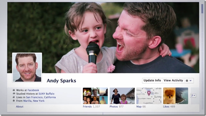
In a very Steve Jobs-esque style, Zuckerberg presented The Timeline.

image

It’s very attractive, very thorough and, I hope, very configurable (hey, I do not want everyone to see my entire life in a chronological order!) I still feel like it clashes too much with the current styling of the rest of the world’s biggest social network, but it was a much needed change, especially with all the pressure from competing platforms like Twitter and Google+ stealing the thunder (and yes, I know that Twitter is a completely different type of social platform).

But Facebook’s biggest announcement today was not about this new timeline. It was about the new Open Graph.

For those who don’t know, the Open Graph is Facebook’s system through which companies and users alike can integrate their pages into Facebook through the use of the now super popular "Like” button. A couple of years ago you wouldn’t see any website relating themselves to Facebook. Now if a single piece of content on the Internet is not connected to Facebook in some way, it could be considered socially irrelevant, be it an artist, a movie or a new phone. It’s as easy as that.

Now Facebook wants to take it to the next step. They don’t want you to “like” stuff anymore. That feels like an endorsement. Now they want you to share every single thing you do.

Are you listening to this song on Spotify? Let your friends know. Are you eating pasta again? Your friends should know as well! How about that hike in the Frost Valley area? Mark that you’ve hiked it! The new Open Graph makes it easy for apps of all kinds to make use of this type of messages.

Here I have to agree with Mashable’s editor Ben Parr: Facebook no longer feels like it needs to attract new users. It’s already the biggest social network. And as of now it still doesn’t have much to fear from users flocking out to competing platforms in huge masses because, frankly, there is still nothing as feature-complete as their service. What it needs now though is to find a way to make users spend more time on Facebook, share more content and, ultimately, provide a bigger source of revenue. It’s all about monetization now.

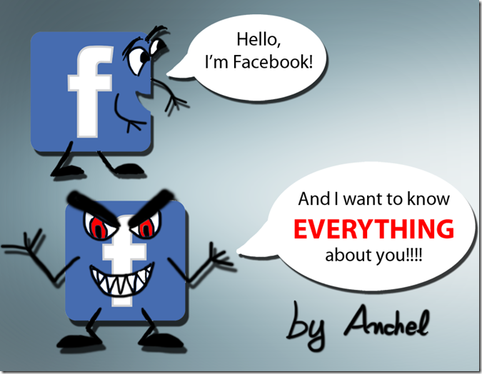
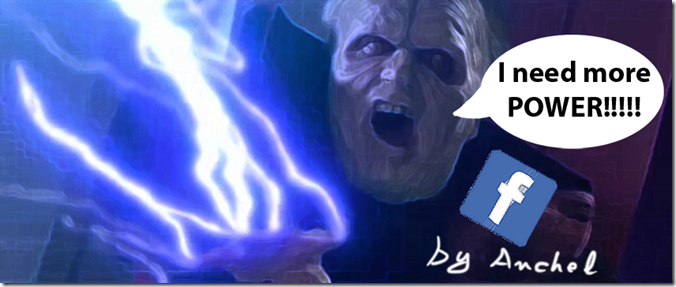
Palpatine Facebook

But at least they are doing it in a way that doesn’t feel as disjointed or incompetent as what other companies have done in the past. Just take a look at MySpace. Heck, even the famous Tom Anderson from MySpace (you know, the guy that everyone had on MySpace when they first created their accounts) is giving it his full support and has been enthusiastically blogging live about these new changes… from Facebook itself!

While I posted a comical reaction to these new Facebook announcements, the truth is that I am very confident that they are going to have a very positive effect online as a whole. If anything, this social network, with all its flaws and privacy controversies, has helped us realize the potential of a social web more than any other. From company pages full of promotions to news sharing, going through picture sharing and online social gaming. And now it’s on to its next major step.

For that, they have my full support.

Categories
Internet and technology Microsoft

Windows 8, my first review!

image

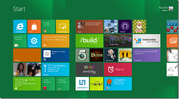
Alright, so here I am! Writing this blog post straight from Windows 8 running on my laptop!

Some people have already asked me to write a first impressions review of it, and I sincerely couldn’t wait any longer, so here I go!

First of all let me state that I began testing Windows 8 through virtualization with VirtualBox from Windows 7, but that set-up made the entire OS feel clunky, not to mention that VirtualBox doesn’t natively support running screen resolutions that aren’t 4:3, and that totally changes the Windows 8 experience. You see, this is an OS that has been thought from the ground up to work best on widescreen.

So what I’m running at this moment is Windows 8 in a separate partition. Not to worry for those of you who might want to test this out, since this also installs a new boot manager (with Metro style to it!) to choose which OS you want to make your default and lets you change it every time you restart. Simple and easy.

Also this is still a developer preview. Not a beta even, it’s more of an alpha state. Microsoft still has lots of work to do especially in relation to the user interface for those of us without a touch screen.

In fact, let me state it clearly: the new Metro UI, at least the way it is right now, is definitely not as usable for mouse and keyboard.

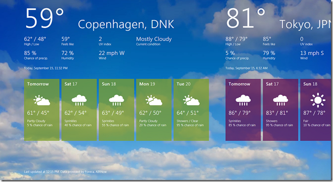
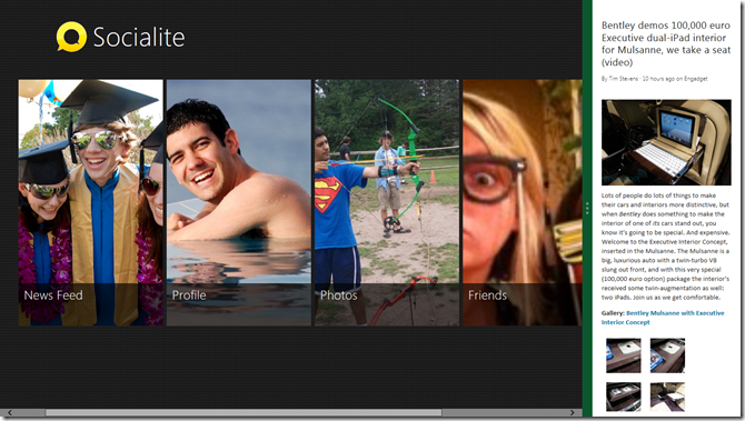
It’s nothing that can’t easily be fixed though. You see, Windows 8 makes heavy use of the panoramic view that has proven to be so usable on Windows Phone 7. That is, an incredibly wide screen full of content that you can scroll left and right. It feels so fresh and clean versus the standard vertical view of most apps these days that it definitely makes a difference. On a tablet, this is absolutely perfect: you simply swipe left or right to view more content.

image
The weather app doesn’t scroll well with mouse/keyboard, but it’s Oh So Beautiful!

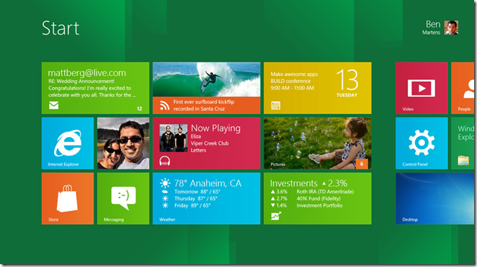
On a normal laptop though, you only have the mouse and keyboard. Some screens like the start screen seen at the top of this article let you use the scroll wheel of the mouse to quickly move horizontally (yes, you use a vertical scroll to pan horizontally…) but some other apps like the weather one just don’t react at all. And even with the touch-pad (which I updated with Synaptic’s latest drivers) it scrolled reeeeally slow when using two fingers to scroll sideways. It just needs a lot of work and I expect Microsoft to fully

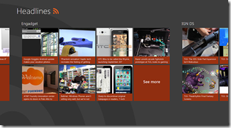
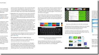
As expected all the metro apps run in full screen. I’m sure most if not all Windows power users will scold at this because it takes too much screen real estate, but I can imagine how the majority of users will love how beautiful and clean these look. Reading articles from the included RSS Feed Reader is such a pleasure!

imageimage

There’s absolutely no distractions, and feeds get their content automatically organized and laid out in a newspaper-like way while still allowing users to save pictures and watch videos, all in the same screen. In that sense, the Metro UI is clearly a winner.

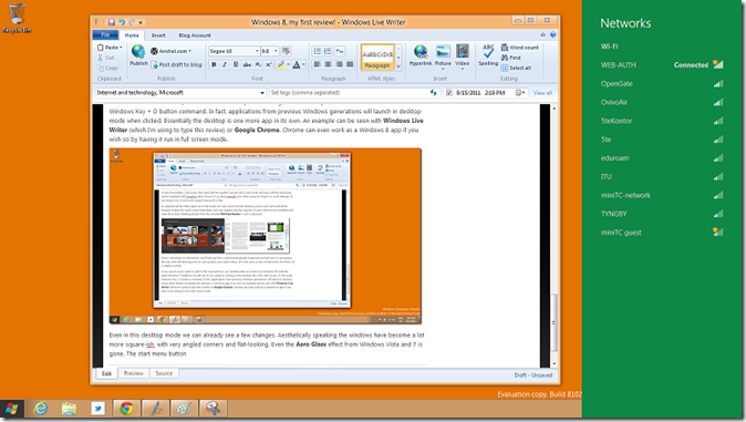
In any case if a user wants to stick to the tried and true user interface that we’ve had since Windows 95 (with the latest Windows 7 additions) he still can. It’s as simple as clicking on the Desktop tile in the start screen. Or the usual Windows Key + D button command. In fact, applications from previous Windows generations will launch in desktop mode when clicked. Essentially the desktop is one more app in its own. An example can be seen with Windows Live Writer (which I’m using to type this review) or Google Chrome. Chrome can even work as a Windows 8 app if you wish so by having it run in full screen mode.

image

Even in this desktop mode we can already see a few changes. Aesthetically speaking the windows have become a lot more square-ish, with very angled corners and flat-looking. Even the Aero Glass effect from Windows Vista and 7 is gone. The start menu button (which looks totally out of place with its black border right now) brings up the tiled Start Screen and toolbar icons like the network options brings up a metro-esque sidebar, all fully animated.

That’s not to say that the change to the desktop mode isn’t very jarring. In fact it still clashes way too much with the rest of the Metro UI. I hope Microsoft can improve on this as much as possible, with small things like having your desktop background and theme color match with those of the Start Screen for coherence purposes.

I will give Microsoft a big applause for one thing though: Windows 8 is now totally cloud-oriented. When you first log in to Windows it asks for your Windows Live ID (which, if you have Messenger, Xbox LIVE or Hotmail among others you already have one). Once that’s done, it will sync all of your apps, settings and so on. For example I had already made some changes to the OS when I was still running it through virtualization. When I run Windows 8 later on in my second partition though, it synced those changes, even the placement of my tiles. That was definitely very neat! Of course Google’s Chrome OS already does something like this, but it’s nice to see it so well integrated within Windows.

As for stability, Windows 8 is doing very well so far, considering that this is still a very early preview. Of course I still get some random lock-ups, especially in the Metro apps. And for some reason my laptop can’t log off properly. But those are things I’m willing to let go in a preview build.

I seriously think that Microsoft is up to something really nice here. It’s showcasing an OS that runs perfectly well on both desktops, laptops and tablets, with a refreshingly new UI that keeps consistency between its other platforms (mainly Windows Phone 7 and the future Xbox 360 UI update) and an exciting new set of features.

image
Running apps side by side in full screen mode is something that will certainly benefit tablet users

And I still haven’t even talked about some of its new features like running apps side by side, the new Windows Explorer, the much-improved task manager, the included demo apps and much more!

Will this become my new day-to-day OS? Not yet. This is pre-release stuff guys, and as such it’s too compromising for me to keep using it as my sole OS. As such I’m moving back to Windows 7 while still keeping Windows 8 on the sidelines to try new things every now and then. But so far I love it! Keep up the good job, Microsoft!

Categories
Internet and technology Microsoft

Quick after-thoughts about the Windows 8 BUILD presentation

image

Well, what can I say! This has been one long, yet exciting conference for developers! Maybe a little too focused on developers for my taste but it IS a conference for them after all.

But what is important here is all that has finally been shown off about Windows 8. And while I still have to try the Developer’s Preview that will be released tomorrow for us Europeans, I do hold my doubts about how easy to use this is going to be with a mouse and keyboard.

As a tablet experience however this seems to be the next big thing. A full-on desktop-class OS on a tiny form factor, optimized for touch and without any of the nuances of the old desktop configurations. It’s beautiful, it’s zippy and it seems like a piece of cake to code applications for. And that is one huge step forward for Microsoft, who until now didn’t have a real tablet strategy to strike back in this so-called post-PC era.

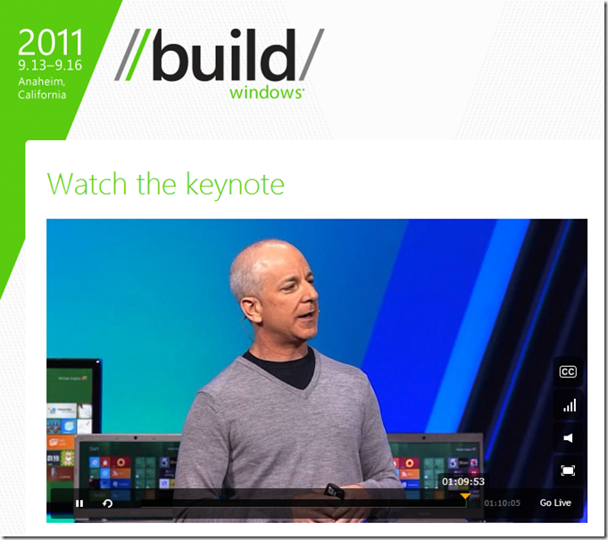
My best compliments to Steven Sinofsky for what he has been able to pull off today, even if he looked nervous like a mouse with a squeaky voice during the first half of the presentation, and as excited as a schoolgirl with a crush during the second half.

But again, I want to see how well this works on a traditional PC. They did show some of this during the conference, but I still don’t buy it. I need to try it myself.

In any case, it’s time to start writing my first impressions on Windows 8 for my weekly Tecnomanía column for VOANoticias.

I’ll post some more after that!

Categories
Internet and technology Microsoft

Watching now… Windows 8 presentation at BUILD

image

Watch the live keynote with Steven Sinofsky presenting the next generation of Windows, Windows 8, which is probably the biggest change since Windows 95 came out. Goodbye, traditional desktop full of icons!

Expect my impressions soon afterwards!

Categories
Internet and technology Stupid things

What does your avatar picture tell of you?

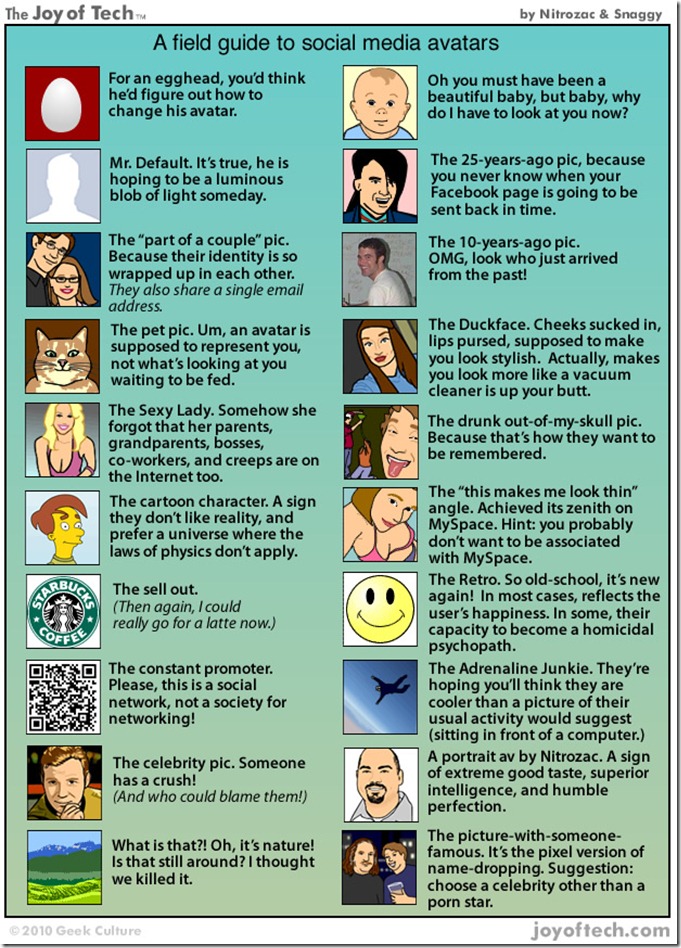
As someone who loves social networks, I also love all the jokes and comic strips that appear around every now and then. And this one in particular from The Joy of Tech hits the spot. It touches on the most common profile pictures on Facebook and Twitter, while poking fun at MySpace.

1585