Categories
Internet and technology Microsoft

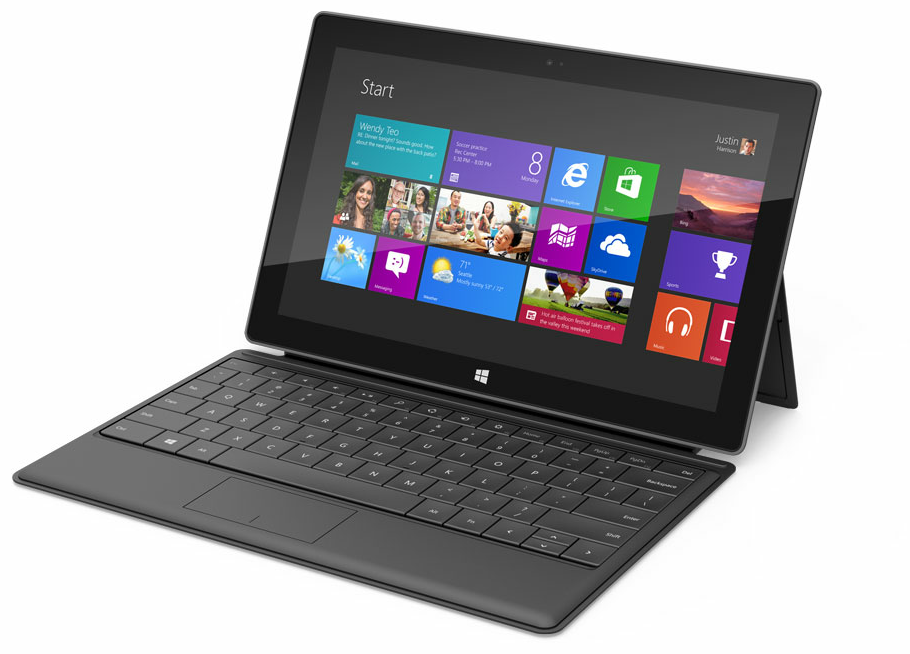
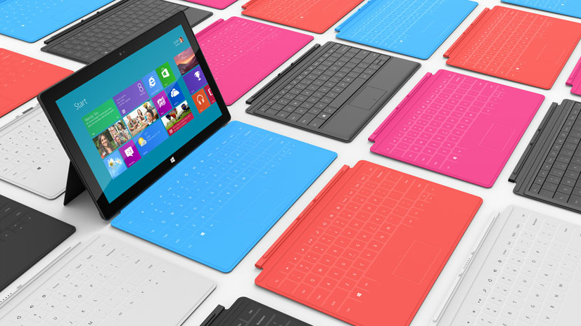
Some quick thoughts on the new Microsoft Surface

I was really skeptical of this when I first heard the rumors of a possible Microsoft tablet. First because I didn’t think they would risk their relationship with all the OEMs like HP, Dell and Sony. Second because a Microsoft-built tablet would probably be too business-oriented and just lack the whole “cool” factor that many tablet users are looking for.

Then I saw the live presentation of the new Surface by Microsoft (they are calling it like that) and it totally blew my mind.

I hadn’t been this excited for a Microsoft product for a long time. Sure, it’s yet another tablet, but they seem to have learned a few tricks from the Apple book of “how to make products look exciting during keynotes” (read: they are all magical). It’s sleek, it screams amazing build quality, it has innovative touches like its colorful touch-covers (which also happen to change the background color of the Windows 8 start screen automatically) and it is the only tablet that comes with a fully functional office suite (Microsoft Office 2013). All of a sudden it makes Windows 8 look a lot more interesting too! This is definitely one bold new direction for Microsoft. Say goodbye to the old “play-it-safe” dinosaur of the last decade.

Now, some would say this is too late, but I don’t think Microsoft is late to the game at all. Look at the current state of the tablet market. Some people have completely replaced their daily computer use for a daily tablet use. I know some friends who just leave their laptops at work and only bring home their iPad so they can still read the email, check Facebook and watch the occasional movie or TV show. But that’s not everyone yet. Many people still need proper document editing and higher quality games that do more than just touch and gyro.

Microsoft is now offering a solution for this with a tablet that not only has all the hardware necessary to make it a possible notebook replacement (or just complementary), but they also have an OS that is custom-made to work great on both tablets and PCs, unlike iOS and Android.

Also it’s interesting to see how during the presentation Microsoft’s CEO Steve Ballmer kept mentioning that this is the perfect integration of hardware and software, making it as good as it can be. Interesting because this is exactly the same mantra that Apple has been pushing for the last 10 years…

And think about the possibilities in gaming: we’re talking about Windows here, so it’s going to accept any gamepad you connect to it. Play a game on the go… and then plug the tablet to the TV when at home and play a game like Portal 2 (which, on the Intel version of the tablet, it might run moderately well).

Right now I have a very unexciting Android tablet (Sony Tablet S). I think I just found its future replacement. But I’ll want to see prices first…

For now all I can say is good move, Microsoft.


Categories
Internet and technology Microsoft

Windows 8, my first review!

image

Alright, so here I am! Writing this blog post straight from Windows 8 running on my laptop!

Some people have already asked me to write a first impressions review of it, and I sincerely couldn’t wait any longer, so here I go!

First of all let me state that I began testing Windows 8 through virtualization with VirtualBox from Windows 7, but that set-up made the entire OS feel clunky, not to mention that VirtualBox doesn’t natively support running screen resolutions that aren’t 4:3, and that totally changes the Windows 8 experience. You see, this is an OS that has been thought from the ground up to work best on widescreen.

So what I’m running at this moment is Windows 8 in a separate partition. Not to worry for those of you who might want to test this out, since this also installs a new boot manager (with Metro style to it!) to choose which OS you want to make your default and lets you change it every time you restart. Simple and easy.

Also this is still a developer preview. Not a beta even, it’s more of an alpha state. Microsoft still has lots of work to do especially in relation to the user interface for those of us without a touch screen.

In fact, let me state it clearly: the new Metro UI, at least the way it is right now, is definitely not as usable for mouse and keyboard.

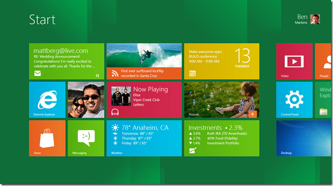
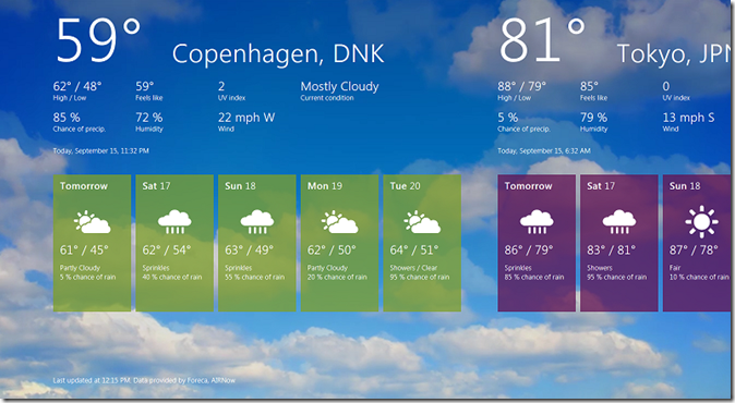
It’s nothing that can’t easily be fixed though. You see, Windows 8 makes heavy use of the panoramic view that has proven to be so usable on Windows Phone 7. That is, an incredibly wide screen full of content that you can scroll left and right. It feels so fresh and clean versus the standard vertical view of most apps these days that it definitely makes a difference. On a tablet, this is absolutely perfect: you simply swipe left or right to view more content.
image
The weather app doesn’t scroll well with mouse/keyboard, but it’s Oh So Beautiful!

On a normal laptop though, you only have the mouse and keyboard. Some screens like the start screen seen at the top of this article let you use the scroll wheel of the mouse to quickly move horizontally (yes, you use a vertical scroll to pan horizontally…) but some other apps like the weather one just don’t react at all. And even with the touch-pad (which I updated with Synaptic’s latest drivers) it scrolled reeeeally slow when using two fingers to scroll sideways. It just needs a lot of work and I expect Microsoft to fully

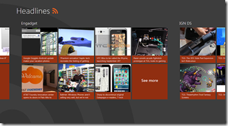
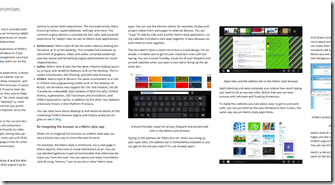
As expected all the metro apps run in full screen. I’m sure most if not all Windows power users will scold at this because it takes too much screen real estate, but I can imagine how the majority of users will love how beautiful and clean these look. Reading articles from the included RSS Feed Reader is such a pleasure!
imageimage

There’s absolutely no distractions, and feeds get their content automatically organized and laid out in a newspaper-like way while still allowing users to save pictures and watch videos, all in the same screen. In that sense, the Metro UI is clearly a winner.

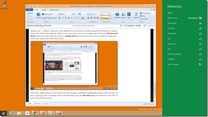
In any case if a user wants to stick to the tried and true user interface that we’ve had since Windows 95 (with the latest Windows 7 additions) he still can. It’s as simple as clicking on the Desktop tile in the start screen. Or the usual Windows Key + D button command. In fact, applications from previous Windows generations will launch in desktop mode when clicked. Essentially the desktop is one more app in its own. An example can be seen with Windows Live Writer (which I’m using to type this review) or Google Chrome. Chrome can even work as a Windows 8 app if you wish so by having it run in full screen mode.
image

Even in this desktop mode we can already see a few changes. Aesthetically speaking the windows have become a lot more square-ish, with very angled corners and flat-looking. Even the Aero Glass effect from Windows Vista and 7 is gone. The start menu button (which looks totally out of place with its black border right now) brings up the tiled Start Screen and toolbar icons like the network options brings up a metro-esque sidebar, all fully animated.

That’s not to say that the change to the desktop mode isn’t very jarring. In fact it still clashes way too much with the rest of the Metro UI. I hope Microsoft can improve on this as much as possible, with small things like having your desktop background and theme color match with those of the Start Screen for coherence purposes.

I will give Microsoft a big applause for one thing though: Windows 8 is now totally cloud-oriented. When you first log in to Windows it asks for your Windows Live ID (which, if you have Messenger, Xbox LIVE or Hotmail among others you already have one). Once that’s done, it will sync all of your apps, settings and so on. For example I had already made some changes to the OS when I was still running it through virtualization. When I run Windows 8 later on in my second partition though, it synced those changes, even the placement of my tiles. That was definitely very neat! Of course Google’s Chrome OS already does something like this, but it’s nice to see it so well integrated within Windows.

As for stability, Windows 8 is doing very well so far, considering that this is still a very early preview. Of course I still get some random lock-ups, especially in the Metro apps. And for some reason my laptop can’t log off properly. But those are things I’m willing to let go in a preview build.

I seriously think that Microsoft is up to something really nice here. It’s showcasing an OS that runs perfectly well on both desktops, laptops and tablets, with a refreshingly new UI that keeps consistency between its other platforms (mainly Windows Phone 7 and the future Xbox 360 UI update) and an exciting new set of features.
image
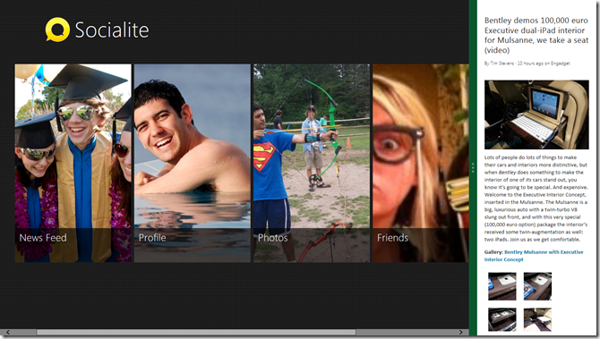
Running apps side by side in full screen mode is something that will certainly benefit tablet users

And I still haven’t even talked about some of its new features like running apps side by side, the new Windows Explorer, the much-improved task manager, the included demo apps and much more!

Will this become my new day-to-day OS? Not yet. This is pre-release stuff guys, and as such it’s too compromising for me to keep using it as my sole OS. As such I’m moving back to Windows 7 while still keeping Windows 8 on the sidelines to try new things every now and then. But so far I love it! Keep up the good job, Microsoft!

Categories
Internet and technology Microsoft

Quick after-thoughts about the Windows 8 BUILD presentation

image

Well, what can I say! This has been one long, yet exciting conference for developers! Maybe a little too focused on developers for my taste but it IS a conference for them after all.

But what is important here is all that has finally been shown off about Windows 8. And while I still have to try the Developer’s Preview that will be released tomorrow for us Europeans, I do hold my doubts about how easy to use this is going to be with a mouse and keyboard.

As a tablet experience however this seems to be the next big thing. A full-on desktop-class OS on a tiny form factor, optimized for touch and without any of the nuances of the old desktop configurations. It’s beautiful, it’s zippy and it seems like a piece of cake to code applications for. And that is one huge step forward for Microsoft, who until now didn’t have a real tablet strategy to strike back in this so-called post-PC era.

My best compliments to Steven Sinofsky for what he has been able to pull off today, even if he looked nervous like a mouse with a squeaky voice during the first half of the presentation, and as excited as a schoolgirl with a crush during the second half.

But again, I want to see how well this works on a traditional PC. They did show some of this during the conference, but I still don’t buy it. I need to try it myself.

In any case, it’s time to start writing my first impressions on Windows 8 for my weekly Tecnomanía column for VOANoticias.

I’ll post some more after that!

Categories
Internet and technology Microsoft

Watching now… Windows 8 presentation at BUILD

image

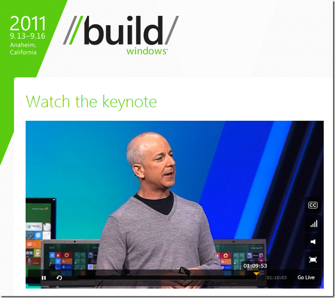
Watch the live keynote with Steven Sinofsky presenting the next generation of Windows, Windows 8, which is probably the biggest change since Windows 95 came out. Goodbye, traditional desktop full of icons!

Expect my impressions soon afterwards!

Categories
Internet and technology Microsoft Stupid things

People keep asking why Windows is slow – Here’s why!

Formatted PC

I saw this comic strip in Spanish and I couldn’t avoid translating it into English. It’s the ultimate truth!

Categories
Internet and technology Microsoft Videogames

Thoughts after the initial shock of the new Windows 8 UI

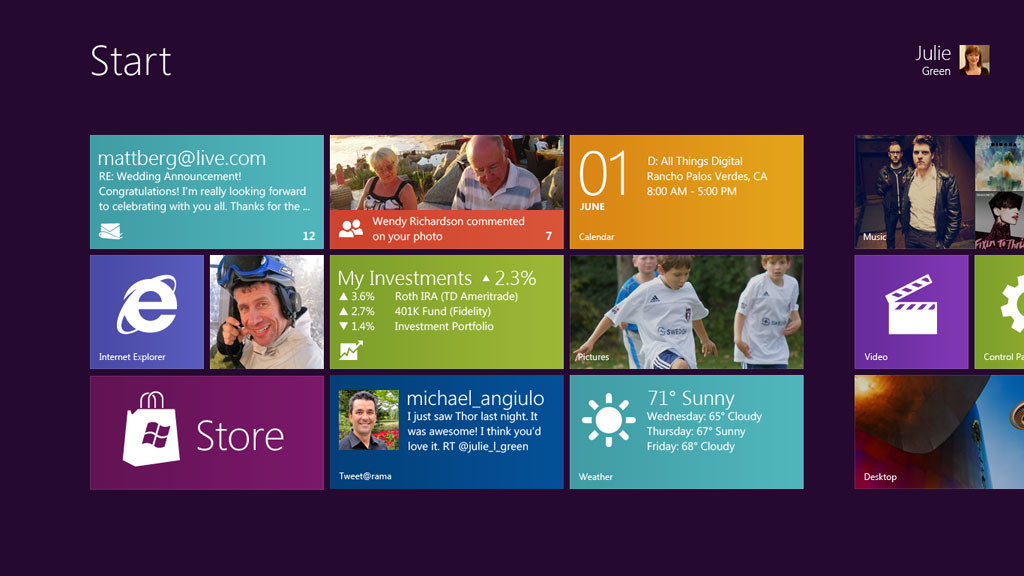
Microsoft has had a lot of trouble with investors lately, all of them pressuring the big software giant to finally take a strong stance towards the rising tablet market. So it should come as no surprise at all that Windows 8 focuses strongly on tablets. What is totally surprising though is the way it’s going to do it.

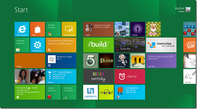
Yes, as shocking as it seems the picture above is the new start screen of Windows 8, be it on a tablet, a laptop or a desktop PC.

The traditional Windows interface will still be available, but in some way I really hope Microsoft will use this only for legacy applications and instead push forward a single, consistent UI for all the users. Otherwise we would be walking into a mess of two UI paradigms running side-to-side, something confusing for users.

And at the same time I’m not completely sure about this new UI when it comes to laptops and desktop PCs. It’s very slick, beautiful and simple, just like the Metro UI from Windows Phone 7. But this new UI would completely change the way people work with Windows, mostly when it comes to multitasking.


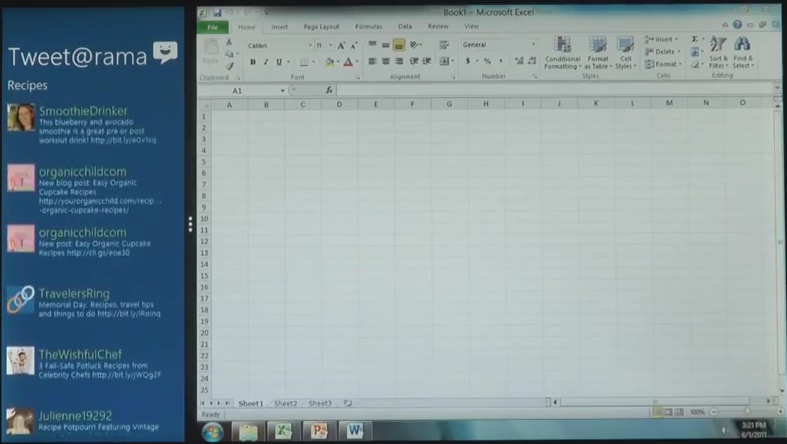
Office 2010 running alongside a new Windows 8 app, showing that old and new can live together

Sure, Microsoft has already shown how multitasking works on Windows 8 but I’m pretty sure that most power users will need much more than that. One example: the traditional drag-and-drop convention when working with files. I for one drag and drop many pictures into Photoshop, a much faster way than going through menus to import a picture into the canvas. Unless Microsoft figures out a way to provide such easy actions I fear I would be returning to the old, Windows 95 era style, and that for me defeats the purpose of having a new modern UI.

Otherwise the new “immersive” UI as Microsoft calls it looks really, really good, and I can see how the everyday Joe will have it much easier to do what he wants on his computer.

Microsoft says that the new immersive apps will be created using HTML5 and JavaScript technologies, which really brings up Microsoft’s latest strategy of “software + services”. I really believe that through HTML5 and other web technologies we can get some really strong functional apps that auto-update thanks to them being hosted on the web (which is, by the way, Google’s stance on the future of cloud computing).

One topic that hasn’t been brought up yet although I’m sure it will later next week during the Electronic Entertainment Expo 2011 (E3 2011) is that of games on Windows 8.

Microsoft has already stated previously that they want to push gaming as a strong part of Windows 8. If you consider the entire range of tablets that will be running this OS it makes sense, seeing how developers will probably make a lot of new games for the form factor.

If you add to this the fact that those games should be perfectly playable on a laptop or desktop PC and they will probably be sold through the Windows Marketplace, you suddenly have a potentially big competitor to Valve’s own Steam online videogame store.

By the way, here’s a prediction of mine: I’m almost convinced that Microsoft will rename all of its gaming services to Xbox LIVE or similar.

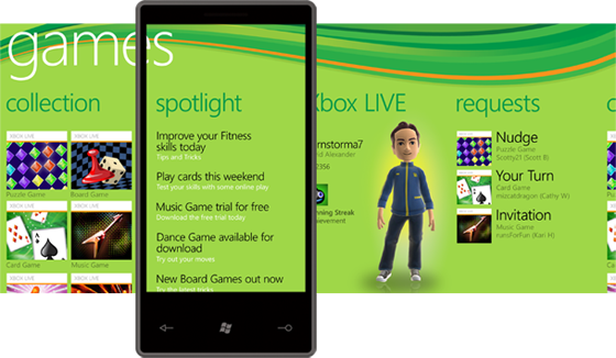
They already put all of the games on Windows Phone 7 under the Xbox LIVE brand, no matter if the games are Xbox LIVE enabled or not.

The Games hub on Windows Phone 7 as it is right now (there will be some major modifications with the Mango update)

We’ve also heard several comments that Microsoft wanted to unify all of their entertainment services under the Xbox name as well, such as Zune. And finally, Microsoft recently merged the Games for Windows forums with the Xbox forums. So don’t be surprised if we see Microsoft trying to push Windows 8 as Xbox compatible. Of course I don’t mean that Xbox 360 games will run on a PC, but rather that it will be considered another platform for the Xbox brand.

Obviously these are just my thoughts, not anything that is fully backed up by quotes or facts.

In the end I’m truly excited about the prospect of Windows 8. It’s still very early to judge the new UI and I’m sure Microsoft is working hard to make sure it becomes a fully functional one so that users don’t switch back to the legacy UI. As such I’m impatient. I can only try to guess how successful this move will be for Microsoft, but information is still too scarce to know for sure yet. As a heavy Microsoft user though I truly hope they get it right.