Categories
ITU Copenhagen UX & Prototyping Videogames

What’s this? A map? And who lives there? Does anybody know?

WP_000087

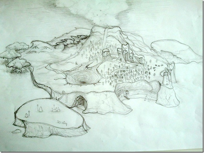
Isn’t this map amazing? This island… it’s so mesmerizing! Check out all the tiny little details in it! There’s a whirlpool, an ice volcano (yes, it’s ice, not lava) and look at that little light bulb at the top of the lighthouse!

Now, I wish I could say that I have drawn that, but sadly my skills are nowhere that good.

Instead this was a drawing by Stine, my muse for the User Experience & Prototyping course at the IT University of Copenhagen.

How did this get to happen? Well, after that little participatory design game I showed her where she came up with the idea of a desert island with a jungle in it, I decided it would be an interesting idea to see her try to draw her own map of an island and fill it up with anything that she found interesting. This was part of my cultural probe which I used to gain more insight into how Stine thinks, acts and what she likes.

When one week later she came to me with this map I was shocked. Definitely so much more than what I expected. It’s clear that she had a lot of fun drawing this!

And she didn’t just draw a bunch of random stuff. She gave a lot of thought to even the tiniest little detail, and she explained to me what this was all about.

The most interesting thing was that many of the things she didn’t really know why they were there. What are those things on the southwest island? Stones? Rocks? Monuments? She said she didn’t know, but she so badly wanted to be able to dive into her own world to see it with her own eyes and discover the mystery of the stones.

The same goes for the houses Northeast. They look like little hills where people live inside them. I asked Stine if those were hobbit holes, and she declined the idea. There could be hobbits inside, sure, but wasn’t it more exciting to go there and discover for yourself? Also they live near a swamp, and who knows what kind of creatures could live there…

What about the castle? Does anyone really live there anymore? Especially with that misty, creepy forest so close to it… Apparently those skeletons from the participatory design game are in that forest, so you might not want to wander for too long in there.

Want more? How about the little village next to the beach? It’s kinda small, but it seems protected from all dangers around thanks to the cliff.

Those are just some of the things that Stine told me about her map of the island. An island that she really wanted to visit, explore and get lost in it, learn its mysteries and who knows what she could find in it?

If this is not a very clear indicator of what Stine wants in a game, then I don’t know what is. As in the participatory design game the keyword here is exploration.

But don’t trust me for this. There’s still a lot of work ahead, and soon enough an interview will reveal more details about Stine’s obsession with exploring new worlds!

Categories
Internet and technology

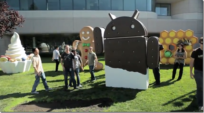
Ice-Cream Sandwich is coming…

image

I’m genuinely excited about tomorrow’s (tonight depending on the region) announcement of Google’s next version of its Android operating system, named Ice-Cream Sandwich.

Even if I’m not an Android user I can appreciate the amazing versatility of the OS. But what had always worried me most about Android was its fragmentation problems and total lack of control when it comes to its UI (not from the user-end, since Android is the most customizable of them all).

And as far as I can tell Ice-Cream Sandwich is going to take huge steps forward to clean all that mess.

The Froyo update was amazing, and Gingerbread had some nifty additions. Honeycomb is surprising but still too young and untested, and so far only for tablets. Ice-Cream Sandwich seems to blend both versions together. Or at least that is my most sincere wish. I want to see Android unified, with an interface that is pleasing to the eye.

And Samsung might deliver just that tomorrow with the next Google Nexus phone. No skins, no TouchWiz additions, just plain vanilla Android. Let’s hope it is as sweet as its logo.

Oh, and if you ask me, I really think that Samsung here can pull a phone that will leave the iPhone 4S in shame.

The presentation will start at 4 AM (GMT +1), so I will not cover the event until later on in the day.

Categories
Internet and technology Mobile

Siri, the funniest phone assistant EVER!

image

I’m fairly surprised with the iPhone 4S Siri assistant.

No, really. I am!

Not because it’s something absolutely new (in fact Apple is the latest one to jump into the voice recognition game) but because they have pulled it out with style.

I don’t think Siri will be useful at all besides typical functions like composing a text message or performing a basic web search. I mean, come on, are you really going to trust a voice-recognition system in scheduling your appointments without double-checking first that it hasn’t made a mistake? So in that regard it’s the same as what most competitors already have.

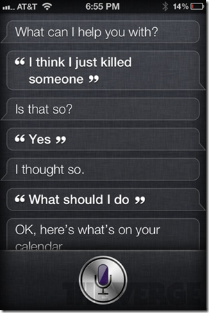
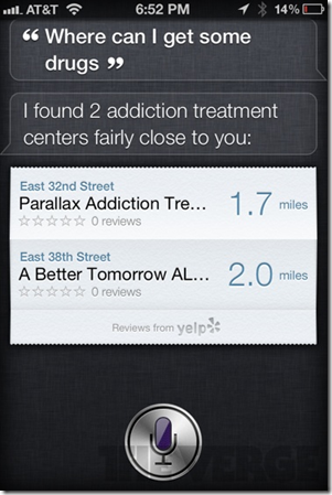
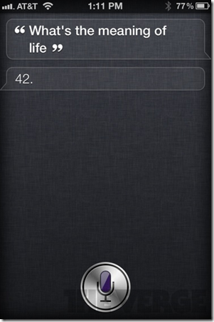
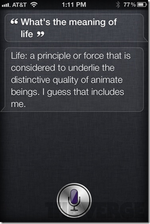
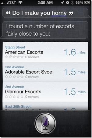
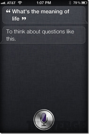
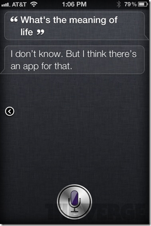
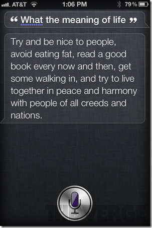
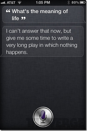
But Siri also has a fun factor that the others lack. As an example here are a few funny real replies of Siri taken by Joshua Topolsky from ThisIsMyNext.com:

image image

image image

image image

image image

image image

image image

image image

image image

Categories
Internet and technology VOA

iPhone 4S: revolution or innecessary?

image

I had already posted this article in Spanish on the Technology section of VOANoticias.com but since I had this English version of the article ready as well I decided to publish it here for those of you who didn’t want to use an online translator for it. Without further delay, here it is:

It’s incredible the amount of media attention Apple can get. Even since the beginning of the year the rumor machines have been churning out speculations about what the future iPhone 5 would have. But as soon as news got leaked that the Cupertino company would present its latest in October, the expectations rocketed sky high: a bigger screen, a thinner profile, no home button, a revolutionary battery…

And Apple definitely deserves the high expectations. When Apple first announced the iPhone it was a real revolution thanks to its innovative multi-touch screen and its ease of use. A year later the iPhone 3G introduced the App Store, changing forever the way people thought of phone applications. The competition rushed to catch up with this new intruder in their own space but they always released incomplete products that were not up to Apple’s standards.

But now the competition has beaten Apple. So it is Apple who has had to rush to catch up to them.

Do not take me wrong. The iPhone 4S is an excellent smartphone that follows on its big brother’s footsteps design and functionality wise. But with such high hopes on the new phone the public was not expecting an iPhone 4S, but an iPhone 5. The number change is more than just a simple perception. The improvements against the previous phone are only, simplified, faster speeds and a better photo and video camera.

With all this, is it even worth paying up for it? The answer depends on our current smartphone.

iPhone 3G and 3GS users will definitely find a lot of worthy additions, since they will get an outstanding superior screen, a front camera for videocalling, HD video recording and fast and fluid apps.

But for current iPhone 4 users, who probably bought it less than a year ago, the purchase is absolutely unnecessary. Apple has given much publicity to its new A5 processor that gives the device faster speeds. But let’s be frank: the iPhone 4 was already a pretty snappy phone that is far from getting obsolete anytime soon.

More important even is that most of the improvements on the iPhone 4S are due to its new operating system iOS5. But the good news for iPhone 4 users is that this upgrade will be absolutely free for them starting October 14th by just plugging the phone to a computer with iTunes. These update includes among others a new notifications system and, in special, support for Apple’s new iCloud service. In this regard iPhone 4 users won’t notice many differences against the new device.

The only things they will miss are the powerful new camera (even though I insist that the iPhone 4 already has a really good camera) and the voice recognition software Siri.

It’s also important to take note that not everything spins around the iPhone. Precisely on the same week of the iPhone 4S presentation the Samsung Galaxy S II arrived in the States. This is a device I can seriously recommend as it is, in my honest opinion, the top of the line of smartphones and it’s about the same price as Apple’s latest iDevice.

And let’s not forget that this very same month Samsung will be announcing its next Google Nexus phone and soon after Finish company Nokia will reveal its Windows Phone 7 devices that it has been waiting for a long time to release.

Even with all that I insist: the iPhone 4S is a magnificent phone with really advanced features that will be a delight for many. Those who have never used an iPhone will be nicely surprised and older users will see in it a great product. But those who already have the iPhone 4 should definitely let it pass. Or look elsewhere for a new phone.

Categories
ITU Copenhagen UX & Prototyping Videogames

Let’s get ideas! What would Stine like?

image

Sometimes you just have no ideas at all when you want to make a game. At least not when you need to create a game for a very specific target audience. And, as mentioned in one of my previous posts, this audience is Stine.

Luckily there are a lot of tools that can help a designer come up with something interesting, and one of my favorites we have learned so far in my User Experience & Prototyping course at the IT University of Copenhagen is the Participatory Design Game, or PD for short.

The objective is very simple: in short it consists of creating a short and simple activity that will open up the creativity of your “muse” you’re creating the game for (Stine) and give you ideas of what she will like.

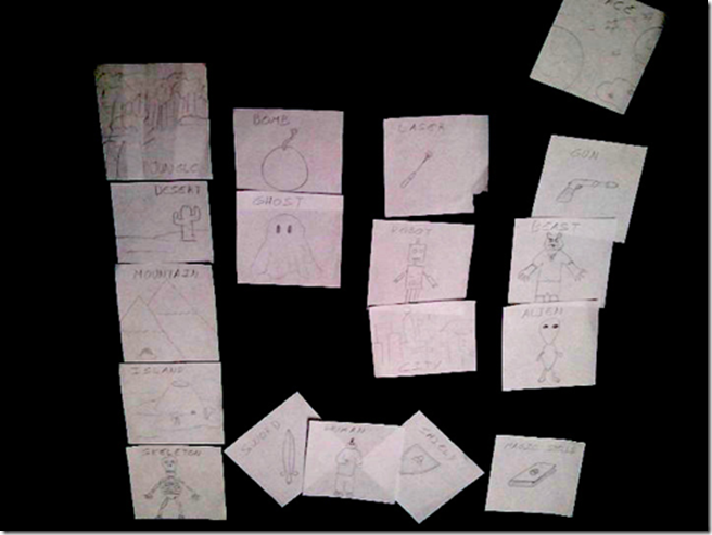
Martin Ørbæk and I created a card game designed specifically for that. Each card has a concept drawn in it, be it a game character, an environment or a weapon or item. These concepts can be combined together to make even more concepts. For example, you can combine a gun with a laser, and you get a “laser gun”, or put together space and an island, and you get a “space island”.

But it is not us who were supposed to combine those. It’s Stine who had to play the game, drawing cards one by one from a pile, all facing the table, and combine those concepts as she sees fit to her liking.

As such Stine showed me her taste and preferences when it comes to videogames. She quickly dismissed certain ideas like those of a monster or space (she doesn’t like space travelling or spaceships, but can live with a game that takes place in space), while preferring environments that would be interesting to explore.

I found it funny that she didn’t use the skeleton card as an enemy, but rather as a remain of a dead body in a desert island, which fueled her interest in discovering how that person died.

A few more cards drawn later, she told me the story of those skeletons: they became ghosts. But not just any type of ghosts, those were explosive ghosts (by making use of the bomb card).

It’s very easy to make a story with Stine around, she doesn’t simply combine ideas. Instead she creates a full world breathing with background stories and interesting characters (the protagonist is a small boy with a sword and a shield who can also conjure spells, but he doesn’t really know how to use them).

It’s a very interesting take on starting a new game as a designer. You’re no longer thinking about doing what you would like to do, but rather making the ideas that she likes into a fully realized game. And it is something that I intend to see through to the end for this course.

Categories
ITU Copenhagen UX & Prototyping

Designing a game for Ms. Stine

imageimage

As part of the course User Experience & Prototyping at the IT University of Copenhagen, we have been required to create the prototype of a game. But not just any game. We have to make a game for a specific person.

Many game developers, more in fact than it should be, don’t really think about the end user when creating a videogame. That is exactly one of the things that we are trying to fix by taking this course.

Here’s the deal: by the end of the semester each of us in our class should have a working prototype of a game that is targeted for a specific person who is either +/- 15 years of difference with us or the opposite gender.

In my case I chose someone who, in order to protect her privacy, I will call simply Ms. Stine or Stine.

We were asked to maintain a blog where we post our comments, points of view and ideas on the topic, and in my case it seemed pointless to start another blog so I will just publish those here (separated under the category UX & Prototyping).

So there’s the main idea: during this semester I will be observing and learning about Stine in order to create a game idea that will work optimally for her. I already have my own previous ideas about her so that is one good starting point, but at the same time I’ve already learned a few things that will make me give some thoughts to some game concepts here and there in order to make those work best.

Again, I will keep on posting here about these investigations. Looking forward to this!