This post has been a long time coming, but for one reason or another I’ve always been postponing it.
However today is finally the day I write about PPS – Pixel Person Shooter, a game I made alongside Andrei Livadariu for the No More Sweden 2013 game jam.
PPS was one of those small ideas I have in my mind that got inspired by watching other people’s experiments at game jams. In particular, this game was inspired by a game I once saw at Exile Game Jam where, even though the game had a 2D top-down perspective and looked completely flat, the level itself was 3D with different ground heights. This meant that you had to figure out the landscape height differences even though they were invisible to the player.
Starting from that point, my idea for PPS was pretty much “What would happen if a top-down 2D multiplayer game suddenly rewarded a player with first person shooter mechanics?”
That was my proposal to Andrei Livadariu for this project. I focused on the gameplay mechanics and aesthetics, while he worked on the programming and controls side of things. The controls part is also important since this game was originally meant to be played on an arcade machine with 4 8-direction joysticks.
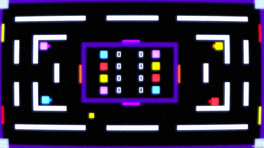
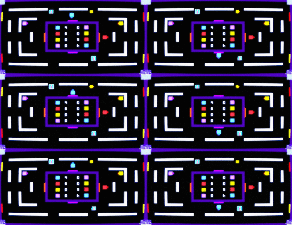
And the beginning of the game the screen looks pretty much like this:
I decided to give the game an old CRT TV look with aesthetics similar to those in Pong, but with some extra visual effects that happen during the gameplay. To achieve this I used a mix of screen filters (a bit of static noise, a lens distortion to produce that monitor look, a glow effect to have the graphics bleed out a bit and some motion blur – which we had to tone down in the end because it was a bit too much).
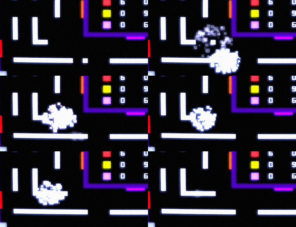
To add some visual flair to this overly simplistic look I made heavy use of particle effects in the form of squares of the same color as the player. When a player is killed (by an opponent shooting at him) he disintegrates into these particles. After a short cooldown time, the player respawns again (using the same particles effect, but this time inverted so that it looks as if the particles are joining together to form the player).
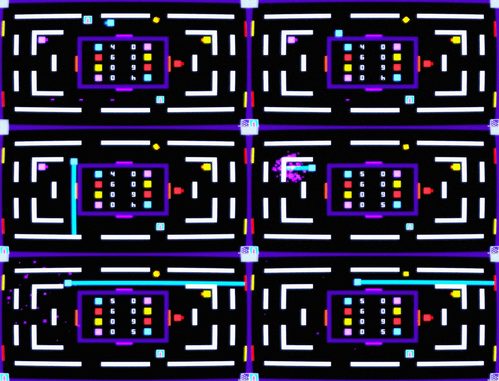
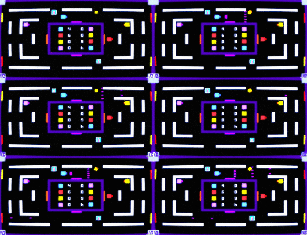
You can see this effect in the animation below, where some power-ups have appeared randomly in the level, such as the laser beam, which destroys anything in a straight line for a few seconds:
There’s also a few portals in the level, the colored walls that can be seen in the sides of the level and surrounding the score box in the middle. Entering one of these portals immediately transports the player to the other side:
An added effect of this is that shots can also go through these portals, which makes it more interesting to plan a distance kill. In the animation below you can see that feature in action with the blue player using one of the other power-ups in the game, the shotgun, which spreads shots in a wider range. A few of these shots go through the red portal on the right and reappear on the bottom left of the screen:
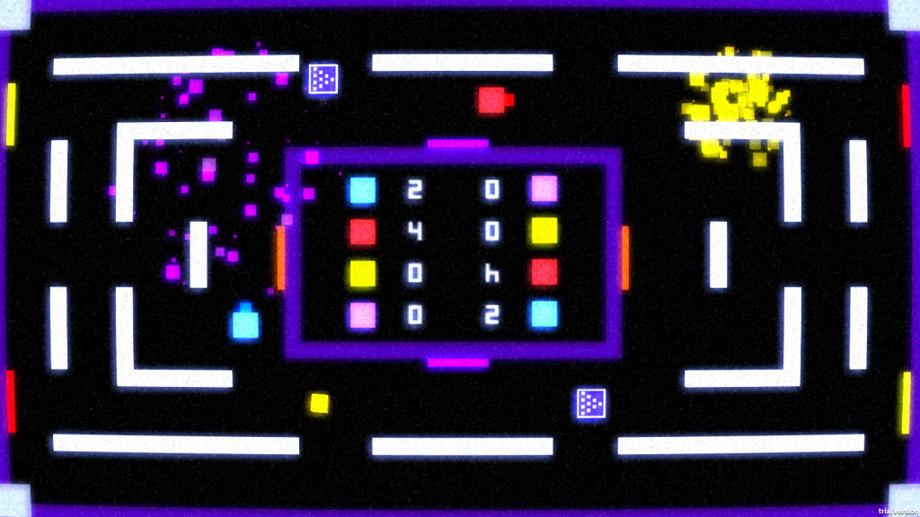
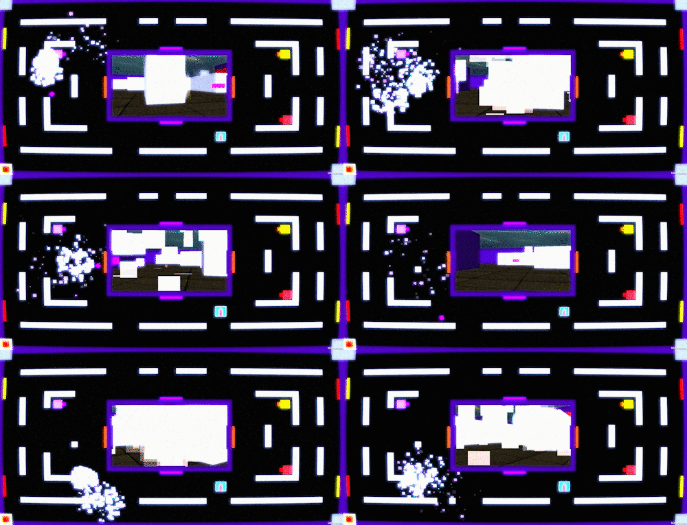
But the big element of this game is still the PPS power-up, that is, the Pixel Person Shooter. This power-up makes the player who picks it up completely invisible for a few seconds (though in later revisions we made this character occasionally flicker so as to give a clue of where the player is). So how does the player know where HE is? Well, up until this point everything has kept a 2D look. But the PPS power-up (the rotating cube seen above) is the only 3D element in view. This is to indicate that whoever gets that power-up will get the first-person view on the middle area.
The advantages are clear (in theory): while everyone else can only move in four directions, the player with the PPS power-up can move in all directions and, even better, he has a bigger gun with more powerful shots that can even destroy the walls in the level.
The destroying the walls part was actually a fix to one of the bigger problems we encountered during the development of the game.
Even though we assumed that being invisible and having more mobility would make it a clear advantage for that player to win, it actually made the game harder to play. First of all because the original arcade machine this game was being designed for had joysticks that weren’t ideal for this type of control. But secondly because it was too difficult to figure out WHERE exactly you were in the map, so finding the opponents to kill them became quite difficult.
The solution was to make it easy for this player to destroy most walls in his way, so that the gameplay would become a simple display of raw power where you just make your way through everything and kill whoever was in the way. Of course this also lets players know WHERE you are since they can see the destruction you are causing (thanks to all the particle effects), which can have all the players gang up on you and destroy you even though you are invisible.
As mentioned earlier, the walls would respawn after a few seconds, leaving the arena back the way it was at the beginning of the game.
Even after all the refinements we made during the game jam, the gameplay was far from balanced and this is something that both Andrei and I wanted to work on by changing several features.
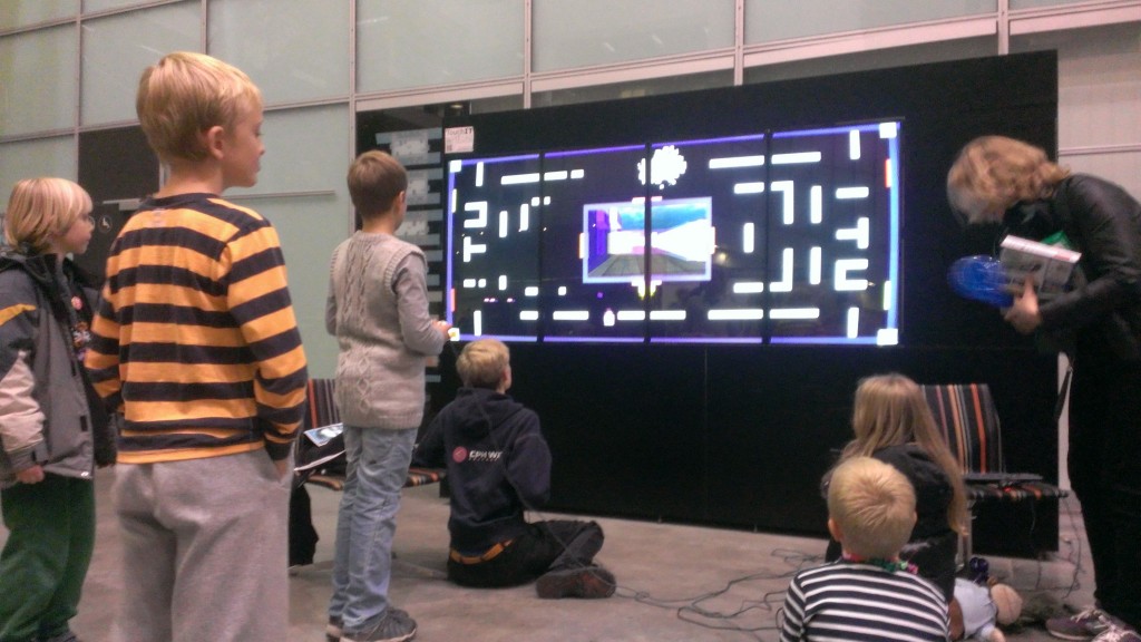
In fact, we had the chance to showcase our game during the Copenhagen Cultural Night 2013, where we invited kids visiting the IT University of Copenhagen to play the game and allow us to see how different players reacted to a modified version of the game on a really wide screen.
This was quite a fun experience since it showed us kids would quickly get the idea of how the game works and take advantage of the power-ups, but it also showed a lot of flaws and ideas on how to fix them.
Andre and I have talked several times about working further on the game, but time constraints and other stuff have impeded it so far. Perhaps some day we will pick this project up again and work out the kinks to make it faster-paced and more engaging.
But until then, you can download the game from its Unicorn 7 page (though mind you that the controls are very tricky one keyboard and you will need to change the input if you want to use controllers).

