Doesn’t this look crude to you? Don’t worry, it’s just a minor sketch of what I would later on improve with Photoshop, but this here was my first attempt at designing a UI for my game for Stine.
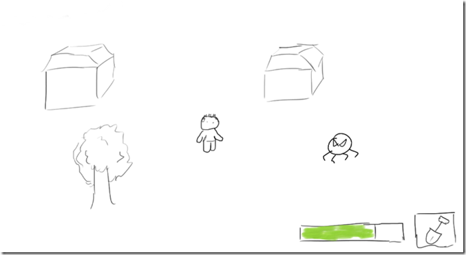
I’m a fan of simple, non-intrusive interfaces, so my first attempt at a UI for the game was really empty, without much in the way of the player.
A simple health-bar and an icon representing the item at hand at the moment. Since the main focus of the game is on exploration I wanted to use as much screen real-estate as possible for the actual gameworld. Also I refused to add a mini-map on the screen at all times, since I thought that would detract my player from the feeling of immersing herself into the world.
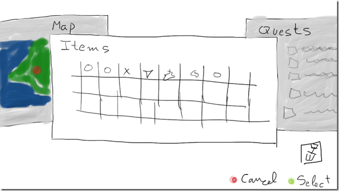
But what if the player gets lost? What if he wants to switch items, or look at the map, or just check what the quest at hand is? Well, for those moments I designed a pause menu with all those functions built in as separate pages that the player can scroll to:
Again, the idea was to keep things simple. Not many buttons, not a thousand icons everywhere. I wanted the player to select an item to keep at hand at all times, and then switch back to another item when necessary. By switching tabs the player could read the quest list and see an overworld map with a red dot marking the current position.
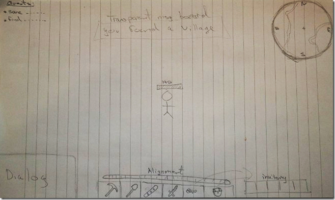
During the User Experience & Prototyping class that we held at my university dedicated to designing a UI I had my partner Martin give it a look and voice his opinions on this. He had also drawn a UI for my game with the ideas he had in mind without looking at what I had done first.
The differences couldn’t be any more shocking.
While far from being very cluttered, this UI showed important information like a much bigger inventory, the name of the village or area you had just entered, a quick-slot item bar, a dialogue box, a mini-map, a quests list and a health-bar located right on top of the main character.
Some things like the mini-map I still was sure I wanted to avoid, as well as the dialogue box (since I don’t expect my game to have a lot of heavy conversations or multiple characters speaking at the same time). The alignment bar was a nice thing, since the player has the possibility of doing good or bad deeds, but I thought that this was not something that needed to be immediately seen at all times on the screen.
But this UI really made me realize about something: in my attempt to make the UI I had been thinking for myself, and not for my player. My UI was very “consolified”, more apt for big TV screens and playing with a game controller.
But Stine, as shown on my previous interviews with her, prefers to play on the computer, with mouse and keyboard. And Martin’s UI lent itself much better for that type of control.
I definitely needed to make a big change here.
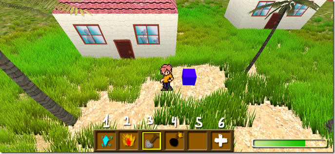
So in comes my new UI. Still aiming towards the simplistic side (also please mind that this is a Photoshop mock-up, not a real in-game UI), with an inventory better geared for PC gamers like Stine, accessible from the numerical row of the keyboard (with the 6th number opening a larger inventory screen so that players can re-organize their items into the quick-access list). The health-bar I still preferred to keep on a corner so as to maintain UI distractions on the sides rather than in the middle of the screen. This game is all about enjoying the exploration after all.
As I said, this is still a far concept from what the UI would look like in the actual game. But these mock-ups and the comments from Martin helped me realize my vision closer to that of what Stine would like.


